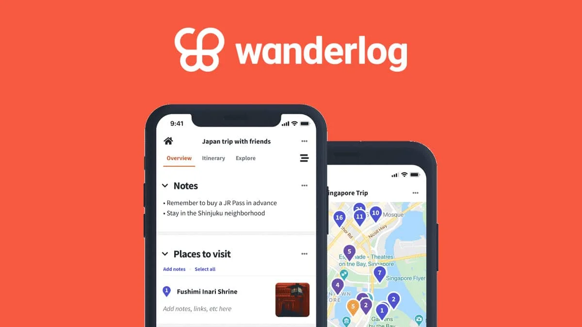
In today’s digitally connected world, travel planning has transformed. Gone are the days of bulky guidebooks and scattered notes. Apps like Wanderlog have emerged as indispensable companions for globetrotters, offering a seamless platform to discover, plan, and share travel experiences.
Dreaming of creating your own travel planning app that captures the essence of Wanderlog? You’ve come to the right place! This comprehensive guide will walk you through the key steps involved in developing an app that empowers users to craft unforgettable journeys.
Understanding the Magic of Wanderlog
Before diving into development, let’s appreciate what makes Wanderlog so popular. Its core features typically include:
- Trip Planning: Allowing users to create detailed itineraries with specific locations, activities, and notes.
- Discovery: Enabling users to browse and save interesting places, attractions, and restaurants.
- Collaboration: Facilitating group trip planning with shared itineraries and voting features.
- Mapping Integration: Visualizing planned routes and points of interest on interactive maps.
- Budgeting: Helping users track expenses and manage their travel budget.
- Offline Access: Providing access to saved information even without an internet connection.
- User-Generated Content: Allowing users to share their own travel experiences, photos, and recommendations.
Your app doesn’t necessarily need to replicate every single feature from day one, but understanding these core functionalities will help you define your Minimum Viable Product (MVP) and future roadmap.
The Journey Begins: Key Steps to App Development
Building a successful app like Wanderlog requires a strategic and well-executed plan. Here’s a breakdown of the essential stages:
1. Define Your Niche and Unique Selling Proposition (USP):
While Wanderlog is a comprehensive travel planner, consider if you want to focus on a specific niche. Perhaps your app will cater to:
- Adventure Travelers: Focusing on outdoor activities, hiking trails, and extreme sports.
- Foodie Travelers: Centering around culinary experiences, restaurant recommendations, and food tours.
- Budget Travelers: Emphasizing affordable accommodations, free activities, and cost-saving tips.
- Sustainable Travelers: Highlighting eco-friendly options and responsible tourism practices.
Identifying your niche and USP will help you target a specific audience and differentiate your app in the market.
2. Conduct Thorough Market Research:
Analyze your competitors (including Wanderlog and other travel apps). Understand their strengths, weaknesses, user reviews, and pricing models. Identify gaps in the market that your app can fill.
3. Define Your App’s Features:
Based on your niche and market research, create a detailed list of features for your MVP and future iterations. Prioritize features based on their value to the user and feasibility of development.
4. Design the User Experience (UX) and User Interface (UI):
This is a crucial stage. Your app should be intuitive, visually appealing, and easy to navigate. Focus on:
- User Flows: Mapping out how users will interact with different features.
- Wireframing: Creating basic skeletal structures of your app screens.
- Prototyping: Developing interactive mockups to test usability.
- UI Design: Crafting the visual elements, including color schemes, typography, and icons, ensuring a consistent and engaging aesthetic.
5. Choose Your Technology Stack:
Selecting the right technologies is vital for performance, scalability, and maintainability. Consider:
- Mobile Development: Native (iOS and Android specific), Cross-Platform (React Native, Flutter), or Hybrid. Each has its pros and cons regarding performance, development time, and cost.
- Backend Development: Languages (Python, Node.js, Java, Ruby), Frameworks (Django, Express.js, Spring), and Databases (SQL, NoSQL).
- Mapping and Location Services: Integration with map providers like Google Maps or Mapbox, and utilizing GPS for location-based features.
- Cloud Services: Platforms like AWS, Google Cloud, or Azure for hosting, data storage, and other backend functionalities.
6. Develop the App:
This is where the actual coding happens. You can choose to:
- Hire an In-house Development Team: Provides more control but can be costly.
- Outsource to a Development Agency: Offers expertise and flexibility but requires careful selection and management.
- Hire Freelance Developers: Can be cost-effective but requires strong project management skills.
Regardless of the approach, ensure clear communication, agile methodologies, and regular testing throughout the development process.
7. Implement Key Features:
Focus on building the core functionalities defined in your MVP first. This might include:
- User registration and profiles.
- Basic trip planning with location search and saving.
- Map integration for visualizing planned locations.
- Simple itinerary creation and management.
8. Integrate APIs and Third-Party Services:
Leverage existing APIs to enhance your app’s functionality. This could include:
- Places APIs: For searching and retrieving information about points of interest.
- Geocoding APIs: For converting addresses to coordinates and vice-versa.
- Weather APIs: To provide weather forecasts for planned destinations.
- Translation APIs: To help users understand information in different languages.
- Payment Gateways: If you plan to offer premium features or booking functionalities.
9. Rigorous Testing and Quality Assurance (QA):
Thorough testing is essential to identify and fix bugs, ensure performance, and provide a seamless user experience. Conduct various types of testing, including:
- Unit Testing: Testing individual components of the code.
- Integration Testing: Testing how different modules of the app work together.
- User Acceptance Testing (UAT): Getting feedback from potential users.
- Performance Testing: Ensuring the app can handle a large number of users and data.
10. Deployment and Launch:
Once your app is thoroughly tested and polished, it’s time to deploy it to the app stores (Apple App Store and Google Play Store). This involves:
- Creating developer accounts.
- Preparing app store listings (app name, description, keywords, screenshots, videos).
- Submitting your app for review.
11. Marketing and Promotion:
Launching your app is just the beginning. You need a solid marketing strategy to reach your target audience. This can include:
- App Store Optimization (ASO) to improve visibility in search results.
- Social media marketing.
- Content marketing (blog posts, articles, travel guides).
- Paid advertising.
- Influencer marketing.
- Public relations.
12. Post-Launch Monitoring and Iteration:
Continuously monitor your app’s performance, user feedback, and analytics. Identify areas for improvement and release updates with bug fixes, new features, and enhancements based on user needs and market trends.
Challenges and Considerations:
Developing an app like Wanderlog comes with its own set of challenges:
- Data Integration: Handling and organizing vast amounts of travel-related data.
- Scalability: Ensuring your backend infrastructure can handle a growing user base.
- Competition: Standing out in a crowded market.
- Monetization: Determining a sustainable revenue model (e.g., premium features, advertising, affiliate partnerships).
- User Acquisition and Retention: Attracting and keeping users engaged.
Also Read : MVP In Software Development: Why is it important for businesses?
The Road Ahead:
Building an app like Wanderlog is a significant undertaking, but with careful planning, a strong team, and a user-centric approach, you can create a valuable tool for travelers worldwide. Remember to start with a clear vision, iterate based on feedback, and continuously strive to enhance the user experience.
So, are you ready to embark on this exciting journey of turning your wanderlust into code? The world awaits your innovative travel companion!