Mistakes During Mockup Design In App Development

app development companies in delhi

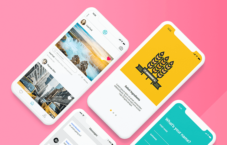
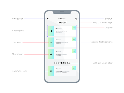
After you have finally finished the detailed requirement of what you want in your app and who will be your targeted audience  , its time to get rough idea about how your app is going to look like and work . The best way to achieve this is to make rough mockup which is combination of black and white outline of all of your screens in your would be app .

Final touchup of mockups will done by professional mobile app designer which can help you with kick start of mockups . Mockups can help you which predicting of your idea and words into screen wise smartphone designs . You will actually be able to see how your app looks like on screen by screen basis which will showcase how it actually goes on . You might actually like the design designed by professionals or want to add on some extra spices to get it delivered according to your taste including button and features as required by you .

Mockups are always proven to be best tool for evaluating your own idea including its feasibility . Sometime the actual way to figure out issues in your app is to write all screens functionality as per user experience .

Another major reason why people do prior mockups is to get opinion from people for your idea . This will add on value to your app success as they will actually be able to see all screens and not just pitch that you might be prior willing to showcase them . Going though mockups for the very first time would be very similar to what users would be playing with the app for the very first time .  It also provide convenience to mobile app developer development team to show them robust features of your app .

Top mistakes during mockup designing are 

#1 : Leaving out screen 

When it comes up to design mockups of your app idea , it is suppose to include every single screen in your app . If even a single screen is missing , consider it incomplete . Confirmation screen after login , terms and conditions page , contact us page , reset password screen , all of these are important during mockups and needs to be there is mockup. It is required even if background screen is same and just minor picture is required to be changed .

#2 : Included buttons does not lead anywhere

Anything which is not required in app functionally would also not to be present in mockups . All the buttons and screen should be interlinked logically .

#3 : Screens included without any way to go to that screen 

Always make sure to keep your user needs , actions and interest in mockups in your app . This will aid you to get all of your screen interconnected . For instance say you have to change your profile pic in app and you don’t have any button to go to that screen to change , then necessarily you have to add some button in it !

#4 : Inclusion of screen with no way to navigate way from them

If you have included a button to go to setting page for profile picture updation , then there must also be button to leave that screen as well . This might not be limited to back button only , but may include extra icons for all of your screens . This will help you with value addition as well as reduction of cluttered screen .

#5 : Failing to number pages 

Numbering the pages is always proven to be beneficial as it gives organised flow of app in logical manner .Pages should rather be numbered serial  in a way that it clearly defines user behaviour which app is in use .

Hope by reading above tips , you can even by your own build some awesome and organised mockup that will help you with transforming your idea into mockup of your apps . We can say mockups are very useful tool before heavily investing on your app and a key to become successful Appreneur .

The way to assess an app

The way to assess an app

Majority of the enterprises across the globe have an app in Google Play or Apple Store or in both. Unfortunately, 75% of apps get utilized just once after being downloaded, and then shunned forever. Do you know the reason for the same? It is a sad fact that excellent ideas don’t necessarily guarantee excellent outcomes. In order to accelerate business values, enterprises must constantly assess their app’s business and technical repercussions, introspect the way they establish connections with consumers and configure their apps to live up to changing realities.

If the app is not helping enterprises to get the ROI they desire, then the next course of action should be mobile app assessment. By assessing your app you get to know how efficiently your app accomplishes your business objectives and find out the gaps to be plugged.

We have devised this mobile app assessment tool to aid enterprises accomplish the ROI they have always dreamt about. By analyzing your mobile app with this instrument you can acquire valuable knowledge about your app performance against your business objectives and where you are going off the boil. This mobile app evaluation also enlightens you about evaluating an app on the basis of business and technical impact.

Our mobile app assessment tool comprises :

An in depth classification of KPIs to evaluate your mobile app are; user acquisition, user retention, user experience, revenue impact, and technical performance

A graded scale to assist you perceive the way your app is performing

Personalized suggestions on next course of action and scope for improvement on the basis of your score

Detailed formula classifications to aid you in arriving at your ROI metrics, including; user acquisition costs, app churn rate, app referral value, and user lifetime value

Access to extra resources to assist you in increasing your knowledge of concepts brought in through our suggestions

Way To Assess An App

To extract maximum from your mobile app evaluation tool, you must have a decent knowledge of the five key areas this assessment will deal with. Also, why they are critical while assessing an app.

User Acquisition

This happens to be the number of users downloading and installing an app from a certain location and locate the app either via natural search, word-of-mouth, or paid campaigns. It is a must to evaluate your user acquisition metrics (installs, bounce rate) as they offer solid peek into the kind of marketing endeavors to get maximum number of new users and direct marketing team to focus on their future efforts.

User Retention

This pertains to the percentage of users who come to an app on the basis of the date of their initial visit. Assessing your user retention details (DAU, MAU, Session length) aids in finding out if your app truly gives value to your users. For example, if you observe that the number of daily active users your app attracts is not in sync with the goal you have set, it means time is ripe to reassess your users’ requirements as their expectations might have changed since your app first launched.

Bottomline Effect

Eventually success of an app hinges on its capacity to multiply revenue or at the very least perceptible ROI. Assessing your app’s monetization will enable you to take well-thought out calls regarding the future of your app and anticipate any fiscal woes that might crop up.

Mobile App Functioning

The assessment yardsticks coming under this area will aid in offering insight into important aspects regarding the way an app performs, for example, if an app malfunction all the time it’s opened on an iPhone. These metrics can be utilized to optimize an app as performance hiccups such as lengthy loading periods and constant app crashes will make user retention almost impossible.

User Experience

Ideal mobile apps have one usual aspect: they are very useful for users. If you want a user to repeatedly use the app then the commodity has to be useful and provides good value. Assessing your user experience with industry standards gives you a good account of where you stand with the app.

Are You Willing To Find Out Where the Gap Lies in the App?

In order to build a valuable app you must know business strategy, product strategy, mobile app architecture, user experience design, and mobile app marketing. These things function in combination to ensure a smooth end-to-end experience. We have a humongous experience of working with several clients and building customized apps. In case you want to know more about your app’s growth or focus on improvement areas then our design thinking workshop is an ideal place to begin. To know more about our design thinking services and the way to book a consultation, click here.

6 product planning mistakes companies should avoid

6 product planning mistakes companies should avoid

Mobile app development projects flounder due to several causes. Inferior UX design, No originality, unable to offer value could be chief reasons. But, usually product failure leads to a failed mobile app planning phase. These are six common mobile app planning errors and actionable tips to bypass them.

6 Usual Product Strategy Errors & Ways To Avoid Them

1. Consumes a lot of time to begin

Several mobile app projects take a lot of time to begin. This is not a very good sign. Creating a futuristic blueprint and offering existing business value is a tough balancing act to perform, and in several cases, companies fail to adapt quickly. Also, technological transformation is very tough to predict, making it nearly impossible to satisfy stakeholders to park their money in development projects for dealing with future scenarios. The longer you keep your idea with you, tougher it gets to totally define a functional and feasible framework for development.This can negatively impact your product’s prospects.

How to keep this at bay

One of the difficult aspects of the development process is to begin. To bypass a long drawn-out mobile app development and launch procedure, it’s ideal to put all your high-level information, research, and specifications in a single document by making a PRD. With a PRD as the basis of your project, you can easily communicate technical viability execution plans, and risk and change management strategies to all team members and stakeholders.

Also, it is a must to opt for an iterative, agile method and concentrate on rapid prototyping. With product needs turning very clear cut, focus your efforts on introducing a minimum viable product (MVP), and building and iterating off your learnings.

2. Coming with product devoid of user value

It’s very tough to ascertain which features and functionalities are essential for user value. Correspondingly, it’s not very convenient all the time to view the full range of technical prospects. The onus is on product team to take the customer through product requirements planning to find out the ideal development solution. A detailed product definition stage comprises developing customer requests into firm product specifications, which can be easily learnt by engineering. A PRD document has the propensity to shape your requests into a robust product specifications. Devoid of proper communication, you would not be able to find out the several consequences of features on product performance.

Way to avoid the same

Gauge the needs for creating a good product vis-a-vis your product beliefs. It’s pertinent to ponder critically over user assumptions, technical assumptions, and business assumptions. Your team has to have knowledge of the market, upcoming trends and technologies, and options for the product to specify the needs for a successful results.

3. Devising needs In A Vacuum

Products can be very complicated, including various systems, subsystems, and functionality; obviously, their needs are complex as well. The certain organizations suffer due to lack of diversity within the team. Product teams must have several people with various areas of expertise: product owners, product managers, developers, engineers, architects, and UX/UI designers etc. This makes sure that several perspectives and opinions come together to carve out a well-thought out product.

How To Avoid It

Engage team members – product owners and product managers, designers, developers, etc. – in product strategy and conceptualization. Agile approach is based on a unified approach, implying several members of your project team collaborate tin the entire product development process, including product definition.

4. Confusing innovation with value

If you rush to include innovation and development expenses can go up. New technologies and abilities can at times trigger panic and turn the execution of new features haywire. This kind of problem can be arrested with proper mobile app planning; a PRD permits lesser errors between development handoffs and highlights the requirements to ascertain the essentiality of feature alteration.

The way to bypass the same

Be focused on your product objectives and keep in mind that you are devising a product for a certain target user. Will this feature or functionality offer anything new or value to the end-user? Is this necessary for the product? If the answer for these is no, then you do away with the feature or implement the same in future not now.

5. Ignoring Competitive Threats

Market viability is imperative for any product, and competitive threats can spoil your development plans. Apart from keeping track of the customer, you must be observant of emerging trends and technologies. At times, your competitors will launch products with features very alike to yours. In such a situation, your team might have to pivot. Yet again, a PRD can be very helpful in these situations as you might have already discussed and documented several solutions to certain features that suits the scope and budget of your project.

The way to bypass the same

Industry and competitor research should be an essential part of your product strategy.

What is your competition providing?

How is your product distinct?

The needs and problems your product solve that other products don’t?

These questions can be ignored at your peril. It’s essential to know your rival’s strengths and weaknesses to make your product unique. With good research, you can highlight your product’s USP.

6. Unable to choose between needs and privileges

You can’t implement all features in the first version of your product. It’s a must to understand the main feature suitable to resolve your users’ central issues. Devoid of proper communication, it’s tough to ascertain the features that are essential and the ones that are good but not a must at this juncture.

How to tackle the same

Put in place a classification system to prioritize features. Sit with your project team to ascertain the features that are important to have versus the features your product can ignore to start with.

Finally

A well-thought out product planning offers your app a good chance in the market. By bypassing the product strategy errors mentioned above, you can offer your team an opportunity to succeed in the market. A mobile app requirements document is a handy tool to get a clarity of requirements and how your product can achieve the same.