

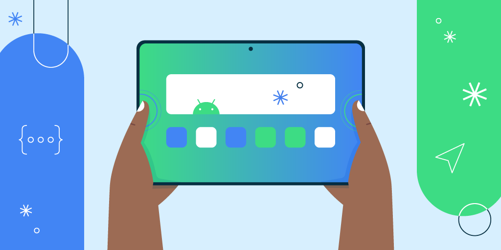
In today’s diverse mobile landscape, users are accessing apps on a plethora of devices, from compact smartphones to expansive tablets. A one-size-fits-all approach simply won’t cut it anymore. If your app looks fantastic on one device but appears distorted or unusable on another, you’re losing potential users. Optimizing your app for different screen sizes and resolutions is crucial for a seamless and engaging user experience.
Here’s a breakdown of how to achieve this:
1. Understand the Landscape:
- Screen Size vs. Resolution:
- Screen size refers to the physical dimensions of the display (measured diagonally in inches).
- Resolution refers to the number of pixels displayed on the screen (e.g., 1920×1080).
- A larger screen doesn’t necessarily mean a higher resolution, and vice versa.
- Aspect Ratios: Different devices have varying aspect ratios (e.g., 16:9, 18:9, 19.5:9). Your app needs to adapt to these variations.
- Pixel Density: Pixel density (DPI or PPI) affects how sharp images and text appear. Higher density means sharper visuals.
2. Flexible Layouts and UI Elements:
- Responsive Design: Embrace responsive design principles. Use flexible layouts that adjust based on screen size.
- Constraint Layouts (Android) and Auto Layout (iOS): These layout systems allow you to define relationships between UI elements, ensuring they adapt dynamically.
- Relative Units: Use relative units like percentages (%) or viewport units (vw, vh) instead of fixed pixel values for sizes and margins.
- Scalable Vector Graphics (SVGs): Use SVGs for icons and images. SVGs scale without losing quality, regardless of screen resolution.
- Adaptive UI Elements: Design UI elements that adapt to different screen sizes. For example, a navigation bar might be a bottom tab bar on a phone and a sidebar on a tablet.
- Scrollable Content: Ensure that content is scrollable when it exceeds the screen’s boundaries.
3. Image Optimization:
- Provide Multiple Image Resolutions: Create different versions of your images for various pixel densities (e.g., mdpi, hdpi, xhdpi, etc., for Android; @1x, @2x, @3x for iOS).
- Use WebP or AVIF: Employ modern image formats like WebP or AVIF to reduce file sizes without sacrificing quality.
- Lazy Loading: Implement lazy loading to load images only when they are visible on the screen, improving performance.
- Image Compression: Compress images to reduce file sizes without significantly affecting visual quality.
4. Testing Across Devices and Emulators:
- Physical Devices: Test your app on a variety of physical devices with different screen sizes and resolutions.
- Emulators and Simulators: Use emulators and simulators to test your app on a wider range of virtual devices.
- Cloud-Based Testing Platforms: Leverage cloud-based testing platforms like BrowserStack or Sauce Labs to test your app on a vast array of real devices.
- Automated Testing: Implement automated testing to ensure consistent behavior across different devices.
5. Platform-Specific Considerations:
- Android:
- Utilize Android’s resource qualifiers to provide different layouts and resources for different screen sizes and densities.
- Use
ConstraintLayoutfor flexible and responsive layouts.
- iOS:
- Employ Auto Layout and Size Classes to create adaptive user interfaces.
- Use asset catalogs to manage image resources for different screen scales.
6. Font Optimization:
- Scalable Fonts: Use scalable fonts that adjust to different screen sizes.
- Dynamic Type (iOS) and Scaled Pixel (sp) units (Android): Utilize platform-specific features that allow users to adjust font sizes based on their preferences.
Benefits of Optimization:
- Improved User Experience: Users will have a seamless and enjoyable experience on any device.
- Increased User Engagement: A well-optimized app is more likely to retain users.
- Reduced Uninstalls: Users are less likely to uninstall an app that functions correctly on their device.
- Enhanced App Store Ratings: Positive user experiences lead to better app store ratings and reviews.
- Wider Audience Reach: Your app will be accessible to a broader range of users.
By implementing these optimization techniques, you can ensure that your mobile app delivers a consistent and engaging experience across all screen sizes and resolutions, ultimately leading to greater user satisfaction and success.