Rise of healthcare mobile apps
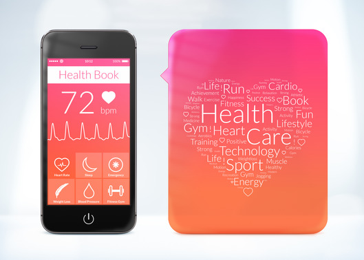
Mobile health is experiencing a paradigm shift as customers are looking for more accessibility and transparency. According to the reports, it is estimated that by 2020, global digital health market revenue will go beyond 200 billion U.S dollars. The health sector will generate second largest revenue in the world. There are huge prospects as far as the health industry is concerned. With the upcoming of the internet and mobile technology, the healthcare organizations are quickly adopting the mobile technologies to boost and expand their businesses.
More than a billion mobile apps are sold each year. More than 90% of the people carry smartphones. So it is a huge market for the healthcare organizations to expand and promote their offerings.
Categories of healthcare mobile apps
There are several categories of healthcare mobile apps. These apps help in assistance in diagnosis and checks for the symptoms. Parent health record can be accessed through these apps. Provision of Electronic chart and lab result review is available. Remote monitoring is another category of healthcare mobile apps which include life scan for diabetic patient, remote heart monitoring, oxygen level check, ECG viewer. Reminder and alerts category have prescription management, appointment reminders etc.
Why healthcare mobile apps are needed?
Healthcare mobile apps are an essential element of a healthcare organization. Previously, the health organization working process was quite slow. With the advancement of the new technology the whole working process of the healthcare has fastened. We need the platforms to increase the awareness about certain diseases. This is where mobile apps come into picture. Not only the apps make us socially aware about the diseases, they also help in improving the conditions of the patients. During the emergencies we need these kinds of apps to get help services.
Perks of having healthcare apps
Healthcare app has many advantages over the conventional ways. Some of the advantages are as follows:
- It has provided provision for greater engagement of the customers. This means that more and more people are focussed on improving their health and wellness by sticking to a very healthy diet plan, regular exercises and following the scheduled medication plans.
- Healthcare apps reduce the cost of the management operations. It helps in taking decisions faster. It reduces the hospitalizations and emergency room visits.
- The health apps store all the information regarding the health of the patients. This contains all the information like type of diseases, medications, daily prescriptions, test results, medical history etc. This is very essential as the physician must have all the vital information about the patient and his disease before treatment
- These lifesaving apps are making a strong impact and they can be used to diagnose diseases. It is observed that people who track their health on the daily basis are much more healthy and happier.
- Health apps promote and track all the vital of the patient during surgeries and operations. It helps the customers to book appointments and reschedules the meetings.
- Sends periodic alerts and reminders to notify patients about the daily doses, availability of doctors and other important information.
Future of healthcare mobile apps
There is a huge amount of future as far as healthcare apps are concerned. As people have don’t enough time for the paperwork and other activities, mobile app reduces the time helping us to save the patient’s life saving time. You can use the apps for emergency services and booking appointments with the doctor. This makes the apps very essential part of present and will continue to be so in the future.
Winklix.com healthcare solutions
Winklix is an award winning app Development Company who is focused on building top-notch apps on iOS and android platforms. We are a motivated bunch of developers, designers and testers who are continuously look for improving the quality of the app. If you are looking for an app development company who can help you in building health apps, then Winklix is for you. Contact us as soon as possible!


