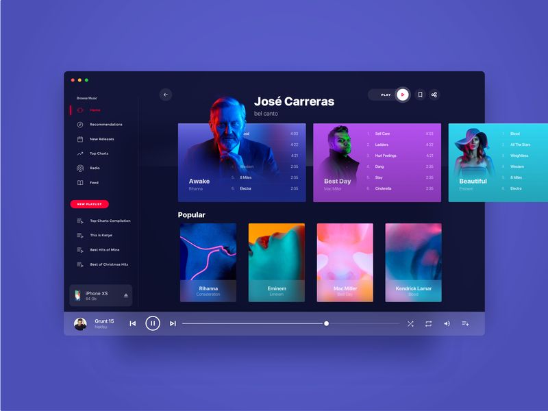
With a large number of people coming online, digital and electronic products are increasingly getting sophisticated design-wise. Alternately, consumer expectations have also sky-rocketed. They want nothing short of spectacular. As a result businesses are pumping in millions to make products look as appealing as possible. However, this does not in any way imply that simplicity has gone out of fashion and it is all about razzmatazz. In some cases, a minimalistic approach is the key. The same holds true for UI/UX strategy as well. Apart from being functional, an incredible user experience also goes a long way in ensuring prosperity for businesses.
Influence of Web Design
User experiences are devised in such a way to make sure that a product is high on performance, and fulfills a certain objective. Everyone desires uniqueness for a website or an app. They also want these items to be reflective of their branding. Having said that, they also want consumers to be mesmerized and stunned by the look and feel. So, a designer has a lot of balancing acts to perform. Ideally web designers should come up with a product that appeals to the people and send across appropriate messages to the public. Therefore, let us have a look into some of the web design innovations that would make an indelible impression upon consumers today.
Top 6 Web Design Trends in line with 2020-21 UI/UX Strategy
1. Cut The Clutter via Whitespace
As they say “too many cooks spoil the broth”, even an innumerable number of elements on a single screen can dilute the user experience to a great extent. By using whitespace appropriately we can resolve this regular design problem and allow the components to have some space to stretch itself. The whitespace provides appropriate spaces in a page, apart from highlighting key components. The appropriate provision of white space assists a designer to emphasize on what is critical – it could be a core message or a call-to-action or a new product in an ecommerce context.
2. Spawn Novelty Through Raw Imperfections
The raw imperfection is very much in vogue today as made up and stylized perfection has somewhat ceded its ground to actual narratives. Perfect can be tedious or artificial at times, and this is very much evident in UI/ UX strategies. An interesting approach would be to introduce design components influenced by true stories, anecdotes, and motifs linked to a brand and its consumers. This way even recall value can be ensured, so devise a mesmerizing user experience that is unique as well.
3. Utilize Actual Images
By using true images you are not only lending credibility to any platform, but infusing a lot of inclusivity. For example, having real images of people that consumers find relatable, with regard to demographics such as age, gender etc, leads greatly to developing trust among current and potential consumers. Hence, develop a bank of original, real images as part of your existing web design trends. It also requires imagination, strategy, and a bit of visualization.
4. Make Provision for Dark Mode
The appeal of dark mode has only multiplied for the last five years. This option is very useful to showcase features on any platform or website. Further Google and several other platforms say that this mode conserves a lot of battery. So, an increasing number of Internet traffic is embracing the dark mode on all devices, social and communication platforms, operating systems, etc. Therefore, by providing a dark mode option, irrespective of what you are designing, consumers are getting unlimited choices. So, consider it in your UI/UX strategy.
5. Extract the Potentials of Full-Page Headers
As we all know, the first impression is the best impression. With full-page headers you can put focus on main messaging that interacts quickly with your target audience.
A full-page is the first few things that people view when they arrive at a new page, and this helps the branding to create a lasting impression. This finds resonance among new audiences apart from increasing trust in current users.
6. Utilize Fluid Shapes To Interact
UI/UX designers are doing away with old-fashioned shapes like square, circle etc and opting for more fluid ones. Traditional ones make web and app interfaces very insipid, while fluidity lends a piercing and novel look. It is even capable of conveying major business values such as flexibility, genuineness, and humongous potential. By using fluid shapes, the sky’s the limit for your business. These make space for new vibes, moods, and flavors, subject to the kind of platforms, products, and tools that are being built.
Creativity And Strategy are Inseparable
With businesses increasingly launching responsive websites and apps, the user interface design needs to be extraordinary and as per the user experience sought. UI/ UX strategies and web design cannot be separated as they work well in unison. Design teams not only have to be creative but also strategic while providing design solutions.
We happen to be one of the most flexible agencies providing a bouquet of design solutions. Our proficiency lies in designing but we have a good knowledge of branding, digital marketing, technology, user journeys, and business growth. We believe that the eclectic mix of creativity and strategy can get your UI/UX strategy right from the start itself


