The IoT Revolution: Reshaping Mobile App Development

The IoT Revolution: Reshaping Mobile App Development

The Internet of Things (IoT) is no longer a futuristic concept; it’s a present-day reality transforming industries and daily lives. At the heart of this transformation lies mobile app development, experiencing a significant paradigm shift. As more devices become interconnected, mobile applications are evolving from standalone tools to central hubs for controlling and interacting with the physical world. For businesses, this translates to unprecedented opportunities to enhance user experiences and create innovative solutions. Let’s delve into how IoT is impacting mobile app development, particularly for those seeking services from a mobile app development company in London.

The Convergence of IoT and Mobile Apps: A New Era

The core idea behind IoT is connecting everyday objects to the internet, enabling them to collect and exchange data. Mobile apps serve as the user interface, allowing individuals to monitor, control, and analyze this data. This synergy is driving innovation in various sectors, including healthcare, home automation, retail, and transportation.

Key Impacts of IoT on Mobile App Development:

  1. Enhanced User Experiences:
    • IoT empowers mobile apps to provide personalized and context-aware experiences. For example, a smart home app can adjust lighting and temperature based on user preferences and real-time environmental data.
    • This demand for sophisticated user interfaces is driving the need for skilled mobile app designers who can create intuitive and engaging experiences.
  2. Data-Driven Insights:
    • IoT devices generate vast amounts of data, which mobile apps can collect and analyze to provide valuable insights.
    • Businesses can leverage this data to understand user behavior, optimize operations, and improve decision-making. This creates a need for app development company  that can handle data analytics.
  3. Remote Monitoring and Control:
    • IoT enables users to remotely monitor and control devices from their smartphones.
    • This has applications in various fields, such as industrial automation, where workers can monitor equipment performance from a mobile app.
    • This is a large reason why businesses look for a qualified mobile app developer that has experience with IoT integration.
  4. Increased Security Considerations:
    • As more devices become connected, security becomes paramount. Mobile app developers must implement robust security measures to protect user data and prevent unauthorized access.
    • Finding a qualified app developer  who prioritizes security is vital.
  5. Integration with Wearable Devices:
    • Wearable devices, such as smartwatches and fitness trackers, are a significant part of the IoT ecosystem.
    • Mobile apps are increasingly integrating with these devices to provide seamless user experiences.
    • This integration requires specialized knowledge, making expertise from a app development company highly valuable.

Also Read : How to develop fantasy cricket app ?

The Future of IoT and Mobile Apps:

The integration of IoT and mobile apps is expected to continue growing, with advancements in artificial intelligence (AI) and machine learning (ML) further enhancing capabilities. As IoT becomes more pervasive, mobile apps will become even more integral to our daily lives.

For businesses seeking to leverage the power of IoT, partnering with a reputable mobile app development company is crucial. Whether you need a simple app to control a single device or a complex platform to manage a network of connected devices, a skilled team can help you bring your vision to life.

If you are looking for mobile app designers in London to help you navigate this exciting landscape, consider those that have proven experience in IoT integration. The future of mobile app development is interconnected, and embracing IoT is essential for staying ahead of the curve.

‘The Psychology of Color in Mobile App Design

The Psychology of Color in Mobile App Design

Introduction

Color is a powerful tool that can be used to evoke emotions, create brand identity, and improve the user experience of a mobile app. As a result, it is essential for app developers to understand the psychology of color and how it can be used to achieve their goals.

The Psychology of Color

Color is a complex topic that has been studied by psychologists for many years. One of the most well-known theories of color psychology is the color wheel, which shows the relationship between different colors. According to the color wheel, colors can be divided into three categories:

  • Primary colors: Red, yellow, and blue
  • Secondary colors: Orange, green, and purple
  • Tertiary colors: Colors that are created by mixing a primary color with a secondary color

Colors can also be described as warm or cool. Warm colors, such as red, orange, and yellow, are associated with energy, excitement, and passion. Cool colors, such as blue, green, and purple, are associated with calmness, peace, and tranquility.

The Role of Color in Mobile App Design

Color plays a vital role in mobile app design. It can be used to:

  • Create a brand identity: The colors that you choose for your app can help to create a strong brand identity. For example, if you want your app to be perceived as fun and playful, you might choose to use bright colors such as yellow and orange.
  • Evoke emotions: Colors can be used to evoke specific emotions in users. For example, if you want to create a sense of trust and security, you might choose to use blue or green.
  • Improve the user experience: Colors can be used to improve the user experience of your app. For example, you can use color to highlight important information or to make your app more visually appealing.

Tips for Using Color in Mobile App Design

Here are a few tips for using color in mobile app design:

  • Use a limited color palette: It is important to use a limited color palette in your app design. This will help to create a cohesive and professional look.
  • Use color to create contrast: Use color to create contrast between different elements of your app. This will help to make your app more visually appealing and easier to use.
  • Use color to guide the user: Use color to guide the user through your app. For example, you can use color to highlight important buttons or navigation elements.
  • Test your colors with users: It is important to test your colors with users to make sure that they are effective. You can do this by conducting user testing or by using a color survey tool.

Conclusion

Color is a powerful tool that can be used to create a successful mobile app. By understanding the psychology of color and following the tips in this article, you can create an app that is both visually appealing and user-friendly.

Stop Stretching! Optimizing Your Mobile App for All Screen Sizes

Stop Stretching! Optimizing Your Mobile App for All Screen Sizes

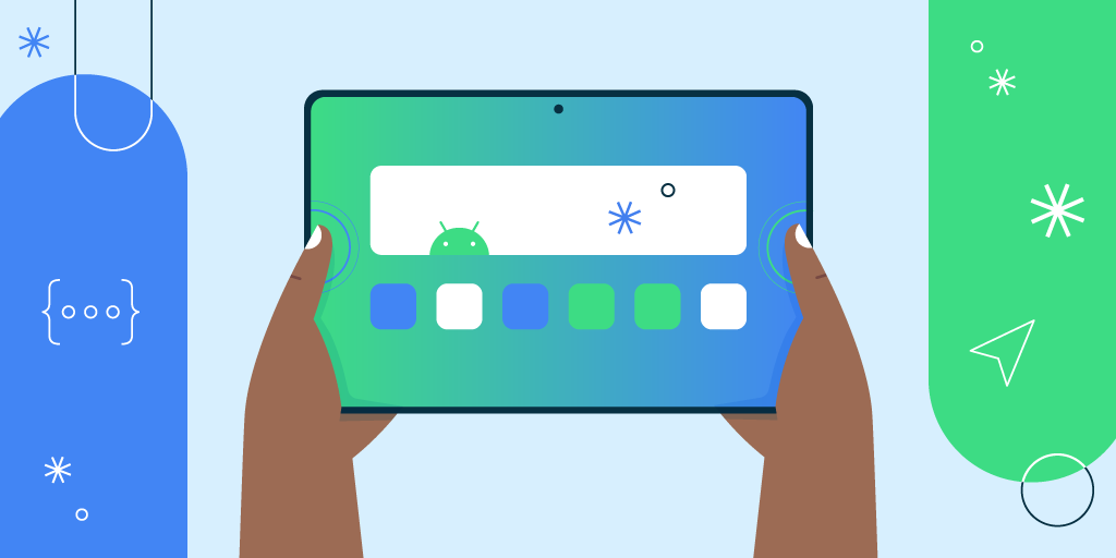
In today’s diverse mobile landscape, users are accessing apps on a plethora of devices, from compact smartphones to expansive tablets. A one-size-fits-all approach simply won’t cut it anymore. If your app looks fantastic on one device but appears distorted or unusable on another, you’re losing potential users. Optimizing your app for different screen sizes and resolutions is crucial for a seamless and engaging user experience.

Here’s a breakdown of how to achieve this:

1. Understand the Landscape:

  • Screen Size vs. Resolution:
    • Screen size refers to the physical dimensions of the display (measured diagonally in inches).
    • Resolution refers to the number of pixels displayed on the screen (e.g., 1920×1080).
    • A larger screen doesn’t necessarily mean a higher resolution, and vice versa.
  • Aspect Ratios: Different devices have varying aspect ratios (e.g., 16:9, 18:9, 19.5:9). Your app needs to adapt to these variations.
  • Pixel Density: Pixel density (DPI or PPI) affects how sharp images and text appear. Higher density means sharper visuals.

2. Flexible Layouts and UI Elements:

  • Responsive Design: Embrace responsive design principles. Use flexible layouts that adjust based on screen size.
  • Constraint Layouts (Android) and Auto Layout (iOS): These layout systems allow you to define relationships between UI elements, ensuring they adapt dynamically.
  • Relative Units: Use relative units like percentages (%) or viewport units (vw, vh) instead of fixed pixel values for sizes and margins.
  • Scalable Vector Graphics (SVGs): Use SVGs for icons and images. SVGs scale without losing quality, regardless of screen resolution.
  • Adaptive UI Elements: Design UI elements that adapt to different screen sizes. For example, a navigation bar might be a bottom tab bar on a phone and a sidebar on a tablet.
  • Scrollable Content: Ensure that content is scrollable when it exceeds the screen’s boundaries.

3. Image Optimization:

  • Provide Multiple Image Resolutions: Create different versions of your images for various pixel densities (e.g., mdpi, hdpi, xhdpi, etc., for Android; @1x, @2x, @3x for iOS).
  • Use WebP or AVIF: Employ modern image formats like WebP or AVIF to reduce file sizes without sacrificing quality.
  • Lazy Loading: Implement lazy loading to load images only when they are visible on the screen, improving performance.
  • Image Compression: Compress images to reduce file sizes without significantly affecting visual quality.

4. Testing Across Devices and Emulators:

  • Physical Devices: Test your app on a variety of physical devices with different screen sizes and resolutions.
  • Emulators and Simulators: Use emulators and simulators to test your app on a wider range of virtual devices.
  • Cloud-Based Testing Platforms: Leverage cloud-based testing platforms like BrowserStack or Sauce Labs to test your app on a vast array of real devices.
  • Automated Testing: Implement automated testing to ensure consistent behavior across different devices.

5. Platform-Specific Considerations:

  • Android:
    • Utilize Android’s resource qualifiers to provide different layouts and resources for different screen sizes and densities.
    • Use ConstraintLayout for flexible and responsive layouts.
  • iOS:
    • Employ Auto Layout and Size Classes to create adaptive user interfaces.
    • Use asset catalogs to manage image resources for different screen scales.

6. Font Optimization:

  • Scalable Fonts: Use scalable fonts that adjust to different screen sizes.
  • Dynamic Type (iOS) and Scaled Pixel (sp) units (Android): Utilize platform-specific features that allow users to adjust font sizes based on their preferences.

Benefits of Optimization:

  • Improved User Experience: Users will have a seamless and enjoyable experience on any device.
  • Increased User Engagement: A well-optimized app is more likely to retain users.
  • Reduced Uninstalls: Users are less likely to uninstall an app that functions correctly on their device.
  • Enhanced App Store Ratings: Positive user experiences lead to better app store ratings and reviews.
  • Wider Audience Reach: Your app will be accessible to a broader range of users.

By implementing these optimization techniques, you can ensure that your mobile app delivers a consistent and engaging experience across all screen sizes and resolutions, ultimately leading to greater user satisfaction and success.